Financial Data Visualization - Visualizing Riches and Profit
Last modified: May 27th, 2023
By Justin Rogers
Data Visualization is the act of putting data into a visual image that people can easily understand. For example, the stock market is displayed with a candle chart so that investors can understand what the price is and where it was. This chart is also colored to candles that end at a higher price and ones that end at a lower price.
Here is my Financial Data Visualization Roadmap:
The Basics
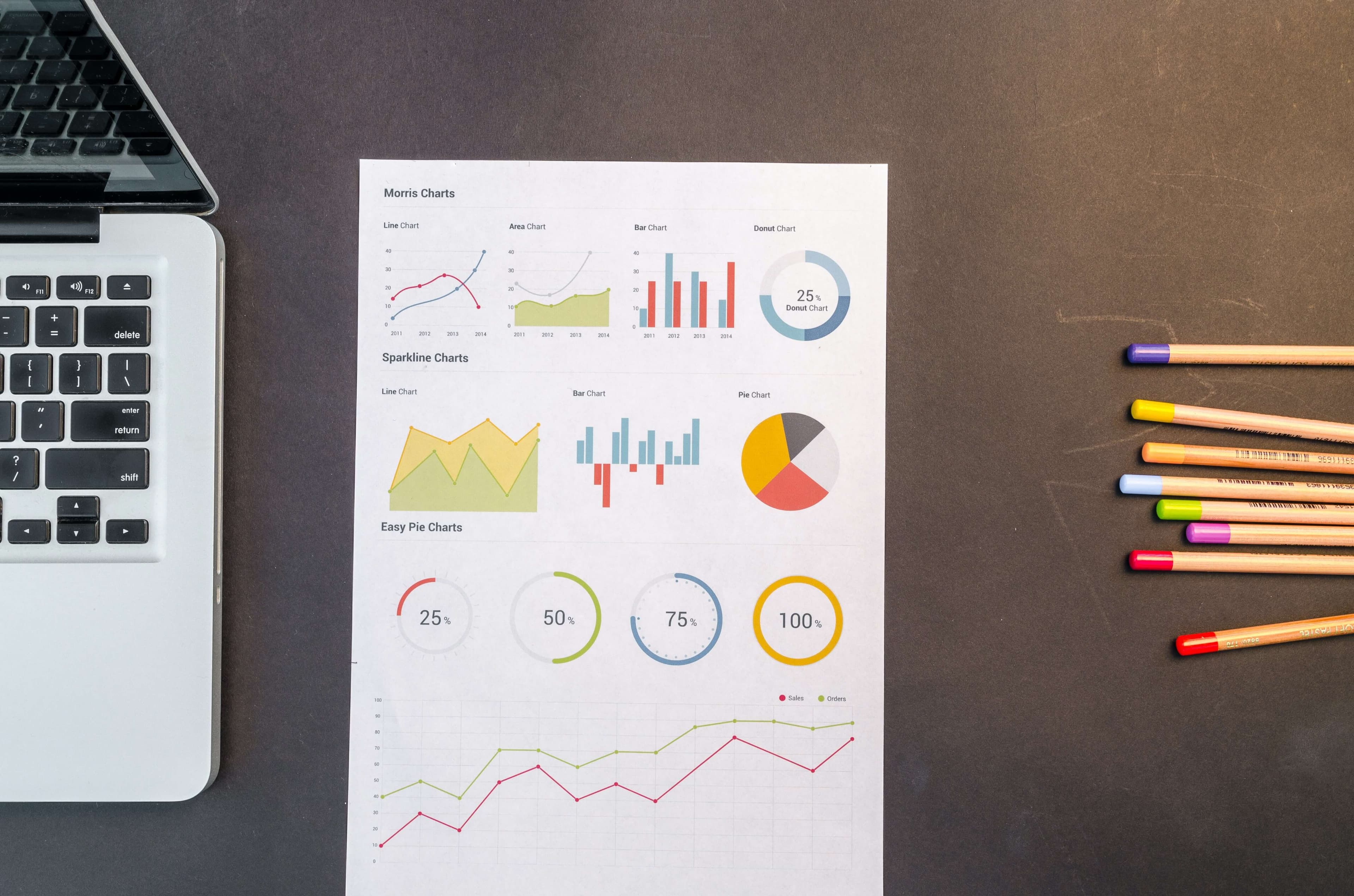
Data has become more and more important in today’s society and with companies basing their entire models on being data-driven. The foundations of being data-driven come in the form of actually understanding what the data means. Data Visualization is an art, almost like graphic design in a way. So many businesses need data to be shown to their customers and so many unique ways to do this.
Programming languages like Python and R, already great tools for financial programming, have great visualization tools so that programmers can fully customize how to display data. In Financial Data Visualization, the type of data you will be working with has a lot of prices or dollar values. When you have to compare profit or sales, many times you will be comparing those numbers to time. With this, you should get very comfortable with time series plots or histograms.
Since you will be plotting a lot of data, rather than just showing past insights, you may be asked to give some insights of the future. Financial predictive analytics is a great way to predict future profit or sales in any area of finance. Crypto investing can use these analytics to track the progress of an ongoing investor and see their projected profit numbers as well as their past performance in one graphic.
Complex Graphics
The more complex the problem, the more complex your graph can be. Basic will always work but you were hired for basic. In this field, you are hired for your creative mind. A complex graphic should have depth to it, even possibly interactive to some extent. There are so many different things you can do to elaborate your findings, especially in the world of finance.
When plotting economic data, you may need to show highlights of market crashes at a certain point in the dataset. When you need to do this, you can split up your graphic and show red where the area of crash or recession was. This helps people see the exact bounds of the crash based on the dataset and from your image might be able to find a trend that is trackable for future events.
Data visualization still has its place in Financial AI as well. When a model produces results, somehow these have to be placed into a graphic. Result data can be in the form of backtesting the AI for accuracy and even forward testing as well. Once you get the results, they will often come by percentage or profit numbers along with dates. If you get profits back, this data can then be visualized again in the form of Asset Efficiency where you calculate financial ratios like Sharpe, Sortino, and Omega to then plot and compare to non-AI models.

Supportive Skills
Knowing how to put data into a graphic is one thing, but the best of the best Financial Data Visualizers are more than just that. They have another skill that goes along with it. This could be a hard skill and a soft skill combined like data visualization and a skill that deals with working with people. Pairing the two together helps you go much farther than just a graphic and it uses your other skills to increase the value of your graphics. A company can pick from thousands of data visualizers, but this is the trait that will make you unique.
Being a good storyteller gets people involved. With storytelling, you can transform a graph into a movie for listeners, just with your words. You can guide your audience into understanding and develop the graphic in their heads exactly how you want it. You can highlight the good and brush over the bad. You can explain what needs to happen in the future or something complicated that happened in the past. There are so many ways to use storytelling in a data field that will help you stand out from others with this supportive skill.
Another option could be negotiation. If you are a good negotiator, you are an asset to your company and can be used in sales meetings. You may be asked to pitch your graphic in the meeting and persuade the listeners into buying a product completely based on the data and how you presented it. You would be able to fill the needs of the potential clients and use them to your advantage when attempting to make your sale.
Conclusion
Data is all over, open source data in particular. To get started with some basic data some free platforms are Kaggle and Tableau. Tableau also has its free version of data visualization software called Tableau Public. You can mess around endlessly with these resources. Microsoft Excel or Google Sheets are applications that anyone with a computer has access to. These software options have very nice beginner-friendly data visualization tools that you can use at the click of a button.
Putting in the work to gain your experience is the first part and there is no better substitute than working tons of hours on something.
Share:
The information provided in this article is not investment advice. We are not responsible for any losses incurred by readers who choose to invest in cryptocurrency. Readers should do their own research before investing in cryptocurrency. Cryptocurrency is a volatile asset and there is a high risk of loss. Readers should only invest money that they can afford to lose.
Desire to be a better Investor?
Are you ready to start implementing scientifically proven methods into your crypto investing?
Desire to be a better Investor?
Are you ready to start implementing scientifically proven methods into your crypto investing?

